
Appjangle: New Homepage (Again)
After I had recently completed a first version of interactive showcases for the Appjangle platform, it was now about time to give a little rework to the homepage. Arguably, it was a bit dull and, more importantly, not very informative – in particular in regards to giving an overview of what Appjangle is good for and what it does.
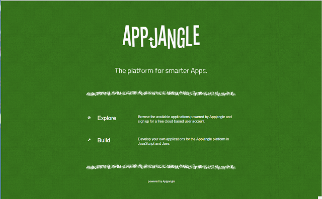
This is how the last version of the homepage looked like:
The redesign, accomplished in 350 min (yes, I am slow and I also love to measure time), focused on the following objectives:
- Allow to understand what the Appjangle platform does.
- Provide an overview of the benefits of the platform.
- Give a clear indication of what a visitor can do next.
Well, this is how the new page looks like:
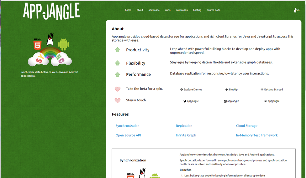
I believe that this new design meets the described objectives much better than the old version. However, there are still plenty of steps which stand between this version and 'perfect'.
Now, I am certainly not what I would call a naturally gifted graphics artist. However, I think it's often a diversion from my usual occupations of writing code and writing academically to move around some pixels. Also, it's nice to see a design develop over time. Actually I started working on this 'entry page' in November 2011 – at that time Appjangle was still called 'Nx Framework', and the Introduction was somewhat wordy: Nx Framework Introduction.
Anyway, next on my list are the sign up screen and the hosting options- when my thesis will grant me some time.
This post is also published on the Appjangle Blog.
 Follow