Good Web Design: PayPal Developer Documentation

I find that developer documentation is often not very pleasant to look at and, more importantly, often very difficult to navigate. I worked briefly with the PayPal REST API and, while I found that at times it can be confusing to deal with the numerous APIs PayPal offers, aesthetically their developer documentation is clear and effective.
What I Like
Clear Overall Design
[caption id="attachment_2511" align="alignnone" width="1108"]

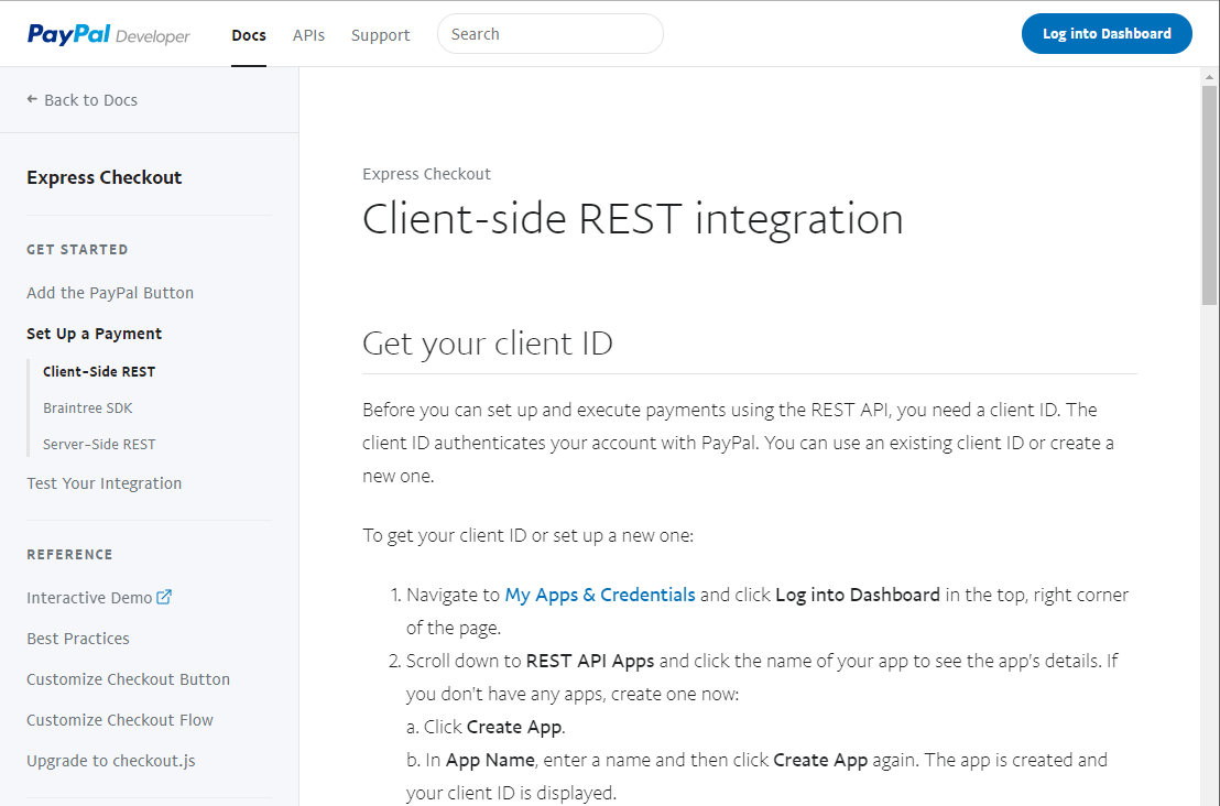
Overall the documentation looks nice and clear. I like the fonts and colours used. The multi-level menu on the left fits in well and provides good means of navigation without feeling overwhelming.[/caption]
Good Instructions and Code Examples
[caption id="attachment_2512" align="alignnone" width="879"]

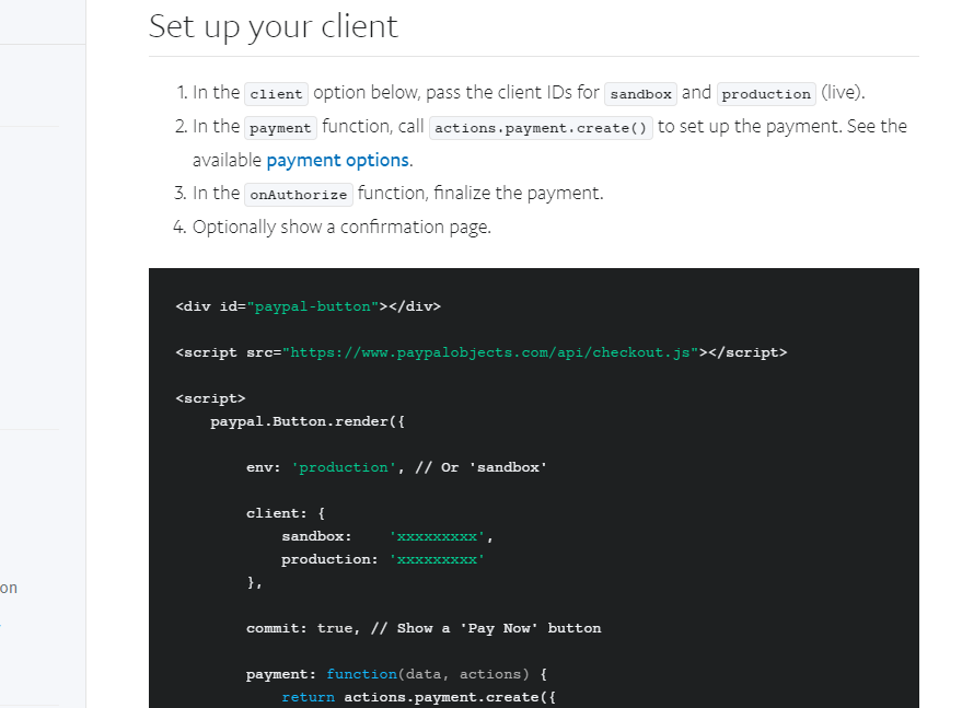
The subheadings are easy to spot and the step-by-step instructions weave code into them quite nicely. Code examples stand out due to the different background colour.[/caption]
Clear and Informative Footer
[caption id="attachment_2513" align="alignnone" width="821"]

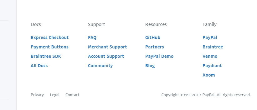
The footer for the page fits nicely into the overall design and gives access to a wide range of resources.[/caption]


